Image Hover Caption Text Effect #HTML5, #CSS3 & #Bootstrap4
Описание
Hello friends, This video is all about Image hover effect using #Html5 new added elements : " figure and figcaption " , this is just another way to add a caption to an image semantically through HTML.
Below , you guys can find the style.css file code.
And If you feel like this tutorial is worth watching please do Subscribe and give a thumbsup.
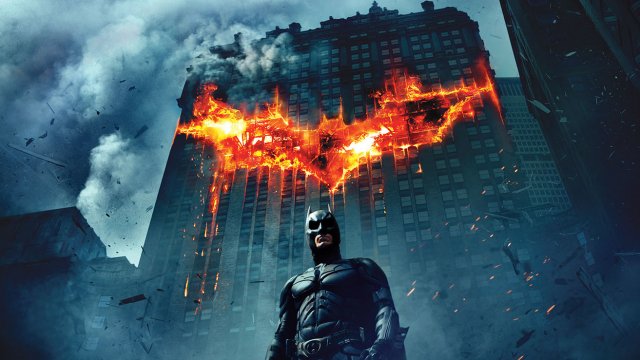
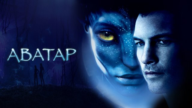
Note: Images which are used in this video are not mine.
Thank you :)
CSS- style.css
==========================
*{
padding: 0px;
margin: 0px;
}
body{
font-family: sans-serif;
font-size: 17px;
background:#eee;
}
section{
width: 100%;
}
.box{
position: relative;
}
figure{
position: relative;
overflow: hidden;
cursor: pointer;
}
figure.effect img{
transition: all .3s;
}
figure.effect:hover img {
transition: all .3s ease-in-out;
transform: scale(1.3);
}
figcaption {
position: absolute;
left: 10px;
top: 10px;
bottom: 10px;
right: 10px;
background: rgba(0,0,0,.6);
opacity: 0;
border: 1px solid #fff;
}
figcaption .desc {
padding: 12px;
width: 100%;
position: absolute;
top: 50%;
left: 50%;
transform: translate(-50%,-50%);
text-align: center;
}
figure.effect:hover figcaption {
opacity: 1;
transition: all .4s ease-in-out;
}
figcaption .desc h4 {
color: #fff;
font-size: 20px;
}
figcaption .desc p {
color: #fff;
font-size: 15px;
}*{
padding: 0px;
margin: 0px;
}
body{
font-family: sans-serif;
font-size: 17px;
background:#eee;
}
section{
width: 100%;
}
.box{
position: relative;
}
figure{
position: relative;
overflow: hidden;
cursor: pointer;
}
figure.effect img{
transition: all .3s;
}
figure.effect:hover img {
transition: all .3s ease-in-out;
transform: scale(1.3);
}
figcaption {
position: absolute;
left: 10px;
top: 10px;
bottom: 10px;
right: 10px;
background: rgba(0,0,0,.6);
opacity: 0;
border: 1px solid #fff;
}
figcaption .desc {
padding: 12px;
width: 100%;
position: absolute;
top: 50%;
left: 50%;
transform: translate(-50%,-50%);
text-align: center;
}
figure.effect:hover figcaption {
opacity: 1;
transition: all .4s ease-in-out;
}
figcaption .desc h4 {
color: #fff;
font-size: 20px;
}
figcaption .desc p {
color: #fff;
font-size: 15px;
}
Рекомендуемые видео